A guide on how to get theoretically sound explanations from complex deep learning models trained on multivariate time series
Photo by João Silas on Unsplash
The what
In this article, we’ll explore a state-of-the-art method of machine learning interpretability and adapt it to multivariate time series data, a use case which it wasn’t previously prepared to work on. You’ll find explanations to core concepts, on what they are and how they work, followed by examples. We’ll also address the main ideas behind the proposed solution, as well as a suggested visualization of instance importance.
The why
It’s not just hype anymore, machine learning is becoming an important part of our lives. Sure, there aren’t any sentient machines nor Scarlett Johansson ear lovers (shoutout to Her) out there, but the evolution of these algorithms is undeniable. They can ride cars, assist in medical prognosis, predict stock, play videogames at a pro level and even generate melodies or images! But these machine learning models aren’t flawless nor foolproof. They can even be misleading, showing an incorrect probability in a sample that is very different from the training data (I recommend having a look at Christian Perone’s presentation addressing uncertainty [1]). Thus, especially in critical applications such as in diagnosing a patient or deciding a company’s strategy, it’s important to at least have some understanding of how the model got to its output value so that users can confirm if it’s trustable or not. Furthermore, in the case of a high-performance model coupled with an adequate interpretation, it can lead to surprising revelations, such as the impact of a gene in the diagnosis of a disease or a certain time of the year on sales.
.](https://cdn-images-1.medium.com/max/2000/1*d5X5qSwNxkEkYLfi6adxDw.gif)
We are not quite there yet in AI. GIF by the awesome Simone Giertz.
So it’s a no-brainer to apply interpretability techniques on all that is machine learning, right? Well, more or less. While simpler models like linear regression and decision trees are straightforward to analyze, more complex models such as a neural network aren’t self-explanatory, particularly in scenarios of high dimensionality of data and parameters. Some architecture changes have been suggested to make neural networks easier to interpret, such as attention weights. However, not only do these approaches require increasing the number of parameters and altering the model’s behavior (which could worsen its performance), they may not give us the full picture (attention weights only indicate the relative importance of each feature, not if it impacted the output positively or negatively). As such, there has been this tradeoff between performance and interpretability, where in order to be able to interpret the model, it would have to be simple enough or specially adapted in some way, restricting its potential.
Fortunately, research has been growing on perturbation-based methods, a family of interpretability techniques that apply changes in the input data (i.e. perturbations) to calculate importance scores, usually without requiring a specific model architecture. This means that these methods can be model-agnostic, making every possible model interpretable and with that eliminating the performance/interpretability tradeoff (albeit with some caveats that we’ll address later). So, let’s go through some of the main concepts behind modern perturbation-based interpretability techniques.
Shapley values
What are they?
Shapley values are a concept from game theory, first introduced by Lloyd Shapley in 1953 (I know that I said “modern”, but bear with me here), which defined a way to calculate each player’s contribution in a cooperative game. It all comes down to a single equation. Consider a total of N players, i the player whose contribution we’re calculating, φi player i’s contribution, S a subset of players excluding i (with |S| meaning the number of players in subset S) and v the function that outputs the total payoff for the set of input players. To calculate player i’s contribution, we calculate the following equation:

Shapley values equation.
In other words, each player’s contribution is determined by the weighted average of that player’s marginal contributions, over all possible combinations of players. Note that by combination I mean a subset of players in the game, regardless of their order, and by marginal contribution I mean how the payoff changes when that specific player joins in, in the current combination. Now that we understood the marginal contribution part, there’s still that messy stuff on the left. These seemingly complex weights can actually give rise to a simple equivalent version of the Shapley values equation:

Equivalent Shapley values equation.
In this equation, we iterate through all possible permutations (R) of the full list of players, instead of just using the unique marginal contributions. Note that by permutation I mean the order in which players are added (e.g. player 1 starts the game, then player 2 joins in, followed by player 3, etc). In this case, it now has the symbol PiR (sorry, can’t really write in equation form in Medium text), which represents all the players that appeared before i, in the current order R. This equivalence means that the weights are set in a way that takes into account how many times a unique marginal contribution appears, on all possible orders of the players. Moreover, it’s the way those weights are defined that allow Shapley values to fulfill a set of properties that ensure a fair and truthful distribution of contributions throughout the players. In order to keep this post reasonably short, I’m not going to list them here, but you can check Christoph Molnar’s Interpretable Machine Learning book [2] if you want to know more.
Example
To illustrate this, as a football fan, imagine the following scenario:
Imagine we have three strikers (i.e. players that play forward in the field, with the main objective to score or assist in as many goals as possible). Let’s call them B, L, and V. Let G be the function that, for a set of strikers in play, outputs how many goals are scored by the team. With that in mind, imagine that we have the following goals scored when each set of players are on the field:

Think that in this game all players will eventually be playing, it’s just a matter of when each one goes in (beginning on the starting squad or joining in the first or second substitution). As such, we have 6 possible scenarios of them getting in the game, to which we need to calculate marginal contributions:
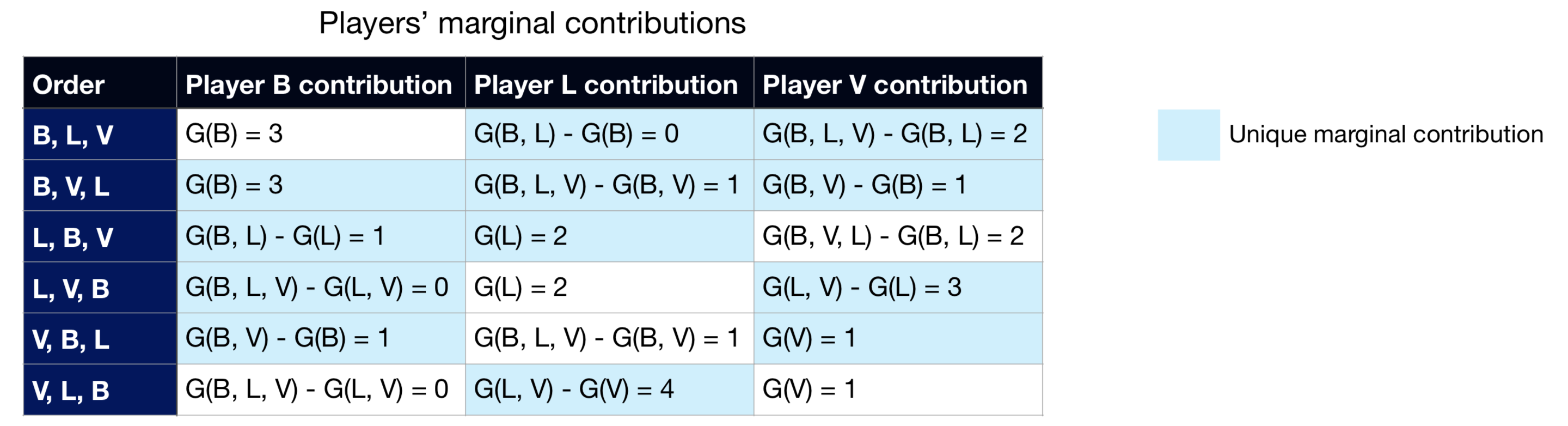
As a last step towards the Shapley values, we just need to apply one of the Shapley values equation (weighted average of unique marginal contributions or average of all orders’ marginal contributions) on each player:

Notice how I calculated the Shapley values through both equations that I showed before, with both leading to the same results. Also, as a consequence of one the method’s properties (efficiency), the sum of all the Shapley values equals the payoff of the grand coalition, i.e. the payoff when all the players are in the game, *G(B, L, V).
So what?
Now, I’m not trying to play games with you by explaining an unrelated 50’s theory. You see, if we replace the idea of “players” with “feature values” and “payoff” with “model output”, we got ourselves an interpretability method. There are just two issues that we need to address to make this useful in machine learning explainability:
-
How do we make this method faster (remember that, in its original form, it requires iterating through all possible combinations of features, on each sample that we want to interpret).
-
How do we represent a missing feature (it’s more complex to remove a feature’s impact than to just ignore a player in game theory; in most machine learning models, all features must always have some value, so we need to find a way to reduce a feature’s influence while still passing it through the model).
SHAP
What is it?
In 2017, Scott Lundberg and Su-In Lee published the paper “A Unified Approach to Interpreting Model Predictions” [3]. As the title suggests, they proposed a new method to interpret machine learning models that unifies previous ones. They found out that 7 other popular interpretability methods (LIME, Shapley sampling values, DeepLIFT, QII, Layer-Wise Relevance Propagation, Shapley regression values, and tree interpreter) all follow the same core logic: learn a simpler explanation model from the original one, through a local linear model. Because of this, the authors call them additive feature attribution methods.
What is this local linear model magic? Essentially, for each sample x that we want to interpret, using model f’s output, we train a linear model g, which locally approximates f on sample x. However, the linear model g doesn’t directly use x as input data. Rather, it converts it to x’, which represents which features are activated (for instance, x’i = 1 means that we’re using feature i, while x’i = 0 means that we’re “removing” feature i), much like the case of selecting combinations of players. As such, and considering that we have M features and M+1 model coefficients (named φ), we get the following equation for the interpreter model:

Additive feature attribution methods’ general equation.
And, having the mapping function hx *that transforms *x’ into x, the interpreter model should locally approximate model f by obeying to the following rule, whenever we get close to x’ *(i.e. *z’ ≈ x’):

Local approximation of the interpreter model, in additive feature attribution methods.
Knowing that the sample x that we want to interpret naturally has all features available (in other words, x’ is a vector of all ones), this local approximation dictates that the sum of all φ should equal the model’s output for sample x:

The sum of the linear interpreter model’s coefficients should equal the original model’s output on the current sample.
So, these equations are all jolly fun, but now what? The trick is in what these φ *coefficients represent and how they’re calculated. Each coefficient *φ, being this a linear model, relates to each feature’s importance on the model. For instance, the bigger the absolute value of φi *is, the bigger the importance of feature i is on the model. Naturally, the sign of *φ is also relevant, as a positive φ *corresponds to a positive impact on the model’s output (the output value increases) and the opposite occurs for a negative φ. An exception here is *φ0. There is no feature 0, so it is not associated with any feature in particular. In fact, if we have an all zeroes vector z’ as an input, the output of the interpreter model will be g(0) = φ0. In theory, it should correspond to the output of the model when no feature is present. Practically, what is done in SHAP is that φ0 *assumes the average model output on all the data, so that it represents a form of starting point for the model before adding the impact of each feature. Because of this, we can see each of the remaining coefficients as each feature’s push on the base output value (φ0) onto a bigger or smaller output (depending on the coefficient’s sign), with the sum of all of these feature related coefficients resulting in the difference between the output on the current sample and the average output value. This characteristic allows us to create interesting force plots with the SHAP package, as you can see in the example below of a model that predicts if a football team has a player win the *Man of the Match award. To see more about this example, check Kaggle’s tutorial on SHAP values [5].
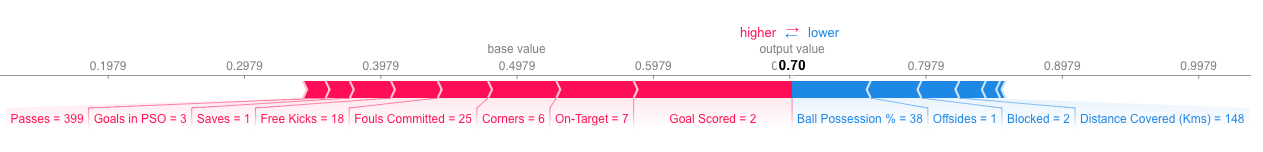
Example of a force plot made with SHAP, on a model that predicts if a football team has a player win the *Man of the Match award. The base value represents the model’s average output on all the data while each bar corresponds to a feature’s importance value. The color of the bar indicates its effect on the output (red is positive and blue is negative) and its size relates to the magnitude of that effect.*
Desirable properties
There’s an additional interesting aspect of the φ coefficients. For everyone except φ0, which again doesn’t correspond to any single feature importance, the authors defend that there is only one formula that simultaneously accomplishes three desirable properties:
1: Local accuracy
When approximating the original model f for a specific input x, local accuracy requires the explanation model to at least match the output of f for the original input x.

SHAP’s local accuracy property.
2: Missingness
If the simplified inputs (x’) represent feature presence, then missingness requires features missing in the original input to have no impact.*

SHAP’s missingness property.
3: Consistency
Let fx(z’) = f(hx(z’)) and z’ \ i denote setting z’i = 0. For any two models f and f’, if

SHAP’s consistency property.
for all inputs z’ ∈ {0, 1}^M , then φ(f’, x) ≥ φ(f, x).
And the formula that fulfills these three properties is… Brace yourselves for a Deja Vu…

Drumroll please.

*Defended by the SHAP paper authors as the only formula for coefficients φ which obeys to the desirable properties of local accuracy, missingness, and consistency.**
Looks familiar? It’s essentially the Shapley values formula adapted to this world of binary z’ values. When before we had combinations of players represented by S, we now have combinations of activated features represented by z’. The weights and the marginal contributions are still there. It’s not a coincidence that these coefficients are called SHAP values, where SHAP stands for SHapley Additive exPlanation.
Efficiency
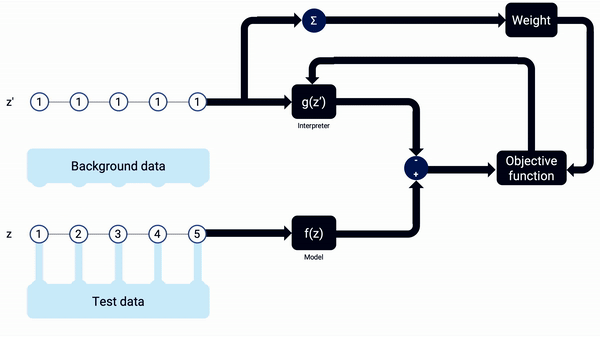
Moving on from the definition of SHAP values, we still have the same two issues to solve: efficiency and how to represent missing values. These are both addressed through sampling and expectation of the missing features. That is, we fix the values of the features being used (those that have* z’ = 1, whose values correspond to *zs) and we then integrate through sample values for the remaining, removed features (those that have* z’ = 0, whose values correspond to *zs‒), in a fixed number of iterations. By going through several different values of the deactivated features and getting their averages, we are reducing those features’ influence on the output. We also speed up the process as we don’t need to go through every possible iteration.

Expectation done in SHAP. It assumes feature independence and model linearity locally.
Knowing of this need for integration of random samples, we need to define two sets of data every time we run SHAP:
-
Background data: Set from where SHAP extracts random samples to fill missing features with.
-
Test data: Set containing the samples whose predictions we want to interpret.
SHAP also speeds up the process by applying regularization on the importance values. In other words, some low importance features will assume a SHAP value of 0. Additionally, considering the unification with other interpretability techniques, SHAP has various versions implemented that have model-specific optimizations, such as Deep Explainer for deep neural networks, and Tree Explainer for decision trees and random forests.
And alongside this unification of methods and optimizations, SHAP also has ready to use visualizations, such as the force plots shown earlier, dependence contribution plots and summary plots, as seen below in the same football example.
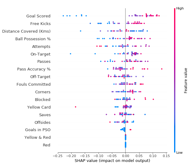
SHAP summary plot for the example of prediction of whether a football team has a player win the *Man of the Match award. Features are ranked from descending average SHAP value from top to bottom and different samples are shown, with how the feature’s value (represented by the color) impacted the output (X axis).*
Are we there yet?
I know how you might be feeling now:

When you find out about SHAP.
And you have reasons for it, considering SHAP’s well-founded theory and the practicality of its python implementation. But, unfortunately, there are still some problems:
-
SHAP has been developed with a focus on TensorFlow. So, at the time of writing, full compatibility with PyTorch is not guaranteed, particularly in the deep learning optimized variations of Deep Explainer and Gradient Explainer.
-
At the time of writing, SHAP is not well adapted to multivariate time series data. For instance, if you test it on this type of data right now, with any of SHAP’s explainer models, you’ll see that the features’ SHAP values add up to strange numbers, not complying with the local accuracy property.
But don’t despair. I’ve found a workaround for this that we’ll address next.
Kernel Explainer to explain them all
How it works
As I’ve mentioned, SHAP has multiple versions of an interpreter model, based on other interpretability methods that it unifies. One of them is the Kernel Explainer, which is based on the popular LIME [6]. It has some clear similarities, such as using a linear model that locally approximates the original model as an interpreter, and using a simplified input x’, where values of 1 correspond to the feature’s original value being used and values of 0 represent the feature being missing. Furthermore, LIME and its SHAP counterpart (Kernel Explainer) don’t assume any specific model component or characteristics, such as a decision tree or backpropagation of gradients, which makes them completely model-agnostic. The main difference relies on the linear model’s loss function. While LIME defines the loss function, its associated weighting kernel and regularization term heuristically, which the SHAP paper’s authors defend that breaks the local accuracy and/or consistency properties, SHAP’s Kernel Explainer uses the following fixed parameters objective function:
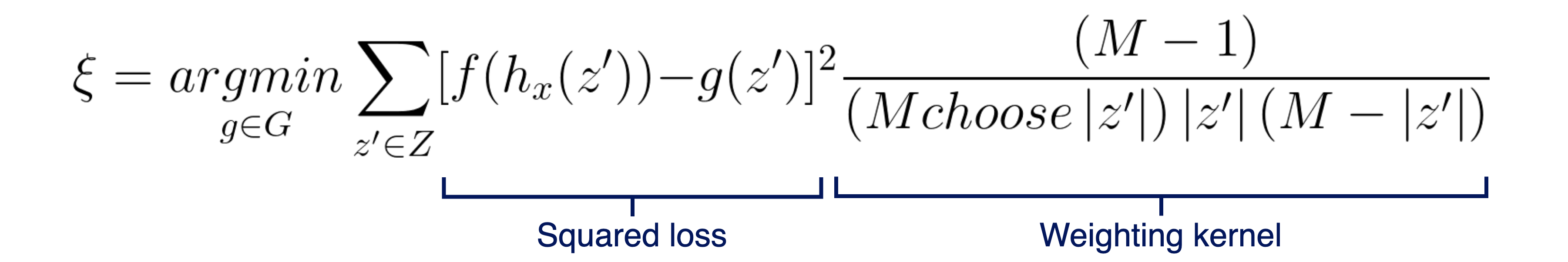
Objective function minimized by the SHAP Kernel Explainer to train its linear regression model.
The squared loss is adequate here, as we want g to approximate f as best as possible. Regarding the weighting kernel, one way to see the validity of these parameters is that the weight is infinitely big when:
-
|z’|= 0, which forces φ0 = f(Ø) -
|z’|= M, which forces ∑φi [i = 0, …, M] = f(x)
Not only do these parameters provide an advantage over LIME, by guaranteeing compliance with the three desirable properties, but also the joint estimation of all SHAP values through linear regression gives better sample efficiency than classic Shapley equations.
Since we’re training a linear regression model, the only major parameter that needs to be defined, besides setting the data to interpret and the background data from where SHAP gets random samples, is the number of times to re-evaluate the model when explaining each prediction (named as nsamples in the python code). As with other machine learning models, it’s important to have a big enough number of training iterations, so as to get a well-fitted model and with low variance through different training sessions. keep in mind that, in this case, we don’t need to worry about overfitting, as we really just want to interpret the model on a specific sample, not use the resulting interpreter on other data afterwards, so we really want a large number of model re-evaluations.
An example animation illustrating how SHAP Kernel Explainer works, in a simplified way. The interpreter g(z’) updates its coefficients, the SHAP values, along the combinations of z’, being reset when the sample x changes. Note that, in real life, more reevaluations (i.e. training iterations) should be done on each interpreter model.
There’s naturally a downside to this Kernel Explainer method. Since we need to train a linear regression model on each prediction that we want to explain, using several iterations to train each model and without specific model type optimizations (like for example Deep Explainer and Tree explainer have), Kernel Explainer can be very slow to run. It all depends on how much data you want to explain, how much background data to sample from, the number of iterations (nsamples) and your computation setting, but it can take some hours to calculate SHAP values.
In short, if Kernel Explainer was a meme, it would be this:

Hey, just because sloths are slow doesn’t mean they aren’t awesome. Meme by my procrastinating self.
The multivariate time series fix (a.k.a. the time-traveling sloth)
As Kernel Explainer should work on all models, only needing a prediction function on which to do the interpretation, we could try it with a recurrent neural network (RNN) trained on multivariate time series data. You can also try it yourself through the simple notebook that I made [7]. In there, I created the following dummy dataset:
 [7].](https://cdn-images-1.medium.com/max/2000/1*l1lht_-nQIKA7-N28pB52w.png)
Dummy multivariate time series dataset used in the example notebook [7].
Essentially, you can imagine it as being a health dataset, with patients identified by subject_id and their clinical visits by ts. The label might indicate if they have a certain disease or not and variables from 0 to 3 could be symptoms. Notice how Var3 and Var2 were designed to be particularly influential, as the label is usually activated when they drop below certain levels. Var0 follows along but with less impact, and lastly Var1 is essentially random. I also already included an “output” column, which indicates the prediction probability of being label 1 for a trained RNN model. As you can see, in general, it does a good job predicting the label, with 0.96 AUC and 1 AUC on the training (3 patients) and test (1 patient) sets.
For the prediction function, which the SHAP Kernel Explainer will use, I just need to make sure the data is in a float type PyTorch tensor and set the model’s feedforward method:
<iframe src=”https://medium.com/media/b5449d42bf393e7d512b011294a41ce5” frameborder=0></iframe>
As it’s a small dataset, I defined both the background and the test sets as the entire dataset. This isn’t recommended for bigger datasets, as you’ll want to use a small percentage of the data as the samples that you want to interpret, due to the slowness of the Kernel Explainer, and avoid having the same data inside both the background and test sets.
However, when we compare the resulting sum of the SHAP coefficients with the output, they don’t exactly match, breaking the local accuracy axiom:

Example of subject 0’s real model output and the sum of SHAP coefficients, in the original SHAP code.
Why is it like this? Shouldn’t this version of SHAP be able to interpret all kinds of models? Well, part of the issue is that, looking at the code, you see that SHAP expects tabular data. There’s even a comment on the documentation that mentions this need for 2D data:
X : numpy.array or pandas.DataFrame or any scipy.sparse matrix A matrix of samples (# samples x # features) on which to explain the model’s output.
In our case, the data is three-dimensional (# samples x # timestamps x # features). This would still be fine if we used a simpler model, one that only uses a single instance to predict the label. However, as we’re using a RNN, which accumulates memory from previous instances in its hidden state, it will consider the samples as being separate sequences of one single instance, eliminating the use of the model’s memory. In order to fix this issue, I had to change the SHAP Kernel Explainer code, so that it includes the option to interpret recurrent models on multivariate sequences. There were more subtle changes needed, but the core addition was this part of the code:
<iframe src=”https://medium.com/media/13a1e8f785900e23e7dc82e77d2f0c30” frameborder=0></iframe>
As you can see, it’s code that is only executed if we previously detected the model as being a recurrent neural network, it loops through each subject/sequence separately and passes through the model’s hidden state, its memory of the previous instances in the current sequence.
After these changes, we can now go to the same example and see that the sums of SHAP coefficients correctly match the real outputs!

Example of subject 0’s real model output and the sum of SHAP coefficients, in the modified SHAP code.
Now, if we look at the summary bar plot, we can see what is the overall ranking of the feature importance:
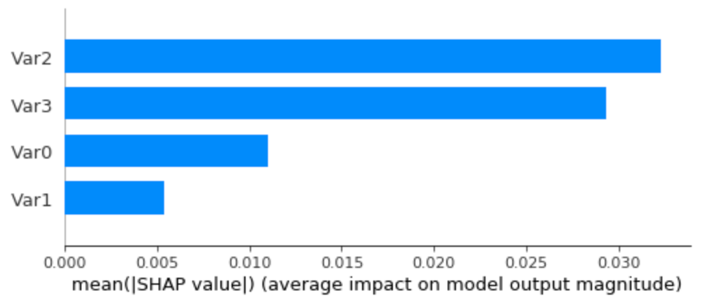
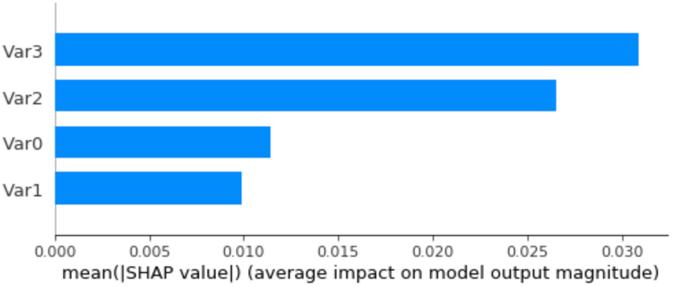
Average SHAP values (feature importance) on the dummy dataset, using all the data as background data.
Looks good! Var2 and Var3 are correctly recognized as the most important features, followed by a less relevant Var0 and a much less significant Var1. Let’s see an example of the time series of patient 0, to confirm if it’s, in fact, interpreting well individual predictions:
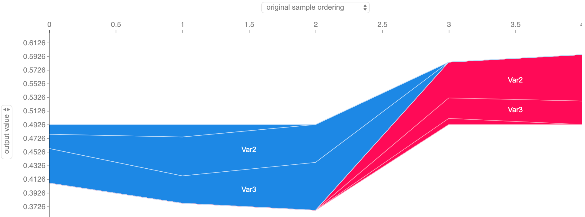
Feature importance along the dummy dataset subject 0’s time series. The border between the red shade (output increasing features) and the blue shade (output decreasing features) represents the model’s output for each timestamp.
All checks out with our dataset as, initially, when Var2 and Var3 have high values, it decreases the output, while in the final stages, with Var2 and Var3 lower, the output increases. We can confirm this further by getting the force plot on timestamp 3, where the output probability rises to above 50%:

Force plot of the feature importance, for the same dummy dataset subject 0, on timestamp 3. The size of each feature value’s block corresponds to its contribution.
Do we really need all that background data?
As SHAP Kernel Explainer is not really fast (don’t elude yourself if you run the previous notebook, it’s fast there because the dataset is very, very small), every chance we have to make it faster should be considered. Naturally, a computationally heavy part of the process is the iteration through multiple combinations of samples from the background data, when training the interpreter model. So, if we could reduce the number of samples used, we would be able to get a speedup. Now think about this: could we represent the missing features by just a single reference value? If so, what would it be?
Thinking about that reference value.
I’d say that even a formula given in the SHAP paper gives us a hint (the one in the “Efficiency” subsection earlier in the “SHAP” part of this post). If we’re integrating over samples to get the expected values of the missing features, why not directly use the average values of those features as a reference value? And this is even easier to do if, in the preprocessing phase, we normalized the data into z-scores. This way, we just need to use an all zeroes vector as the sole background sample, as zero represents each feature’s average value.

z-scores equation, where data x is subtracted by its mean μ and then divided by the standard deviation σ.
Rerunning the Kernel Explainer with just the zero reference values instead of all the previous background data, we get the following summary bar plot:
Average SHAP values (feature importance) on the dummy dataset, using just an all zeroes sample as background data.
We got similar results to the case of using all the dataset as background data! There are small differences in the ranking of feature importance, with Var3 slightly surpassing Var2 as the most relevant feature and a bigger importance given to Var1, although it’s still the least relevant. Beyond the fact that there are these differences, it’s actually interesting since I intended to have Var3 as being the most important feature. You can also check the more detailed time series and force plots in the notebook, but they’re also close to what we got before.
Scale, scale, SCALE
Of course, the previous example uses a toy dataset with an unrealistically small size, just because experimentation is fast and we know exactly what to expect. I’ve also been working on a real health dataset, concerning the check-ups of over 1000 ALS diagnosed patients. Unfortunately, as this dataset isn’t public, I can’t share it nor incorporate it in an open notebook to make the results reproducible. But I can share with you some preliminary results.
To give some context, I trained an LSTM model (a type of recurrent neural network) to predict if a patient will need non-invasive ventilation in the next 3 months, a common procedure done mainly when respiratory symptoms aggravate.
Running the modified SHAP Kernel Explainer on this model gives us the following visualizations:
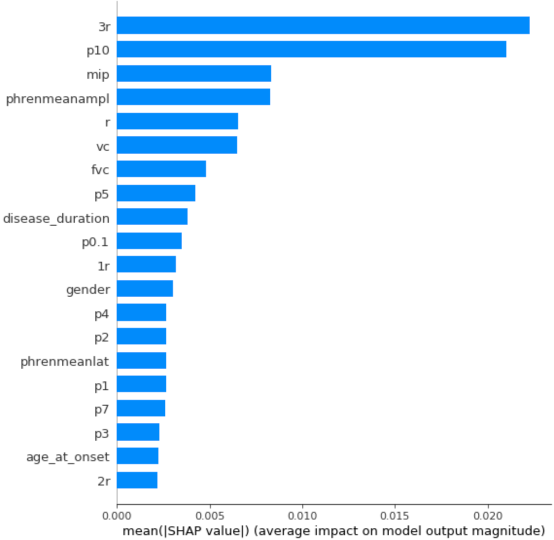
Average feature importance for the ALS dataset.
Feature importance along an ALS patient’s time series. The border between the red shade (output increasing features) and the blue shade (output decreasing features) represents the model’s output for each timestamp.

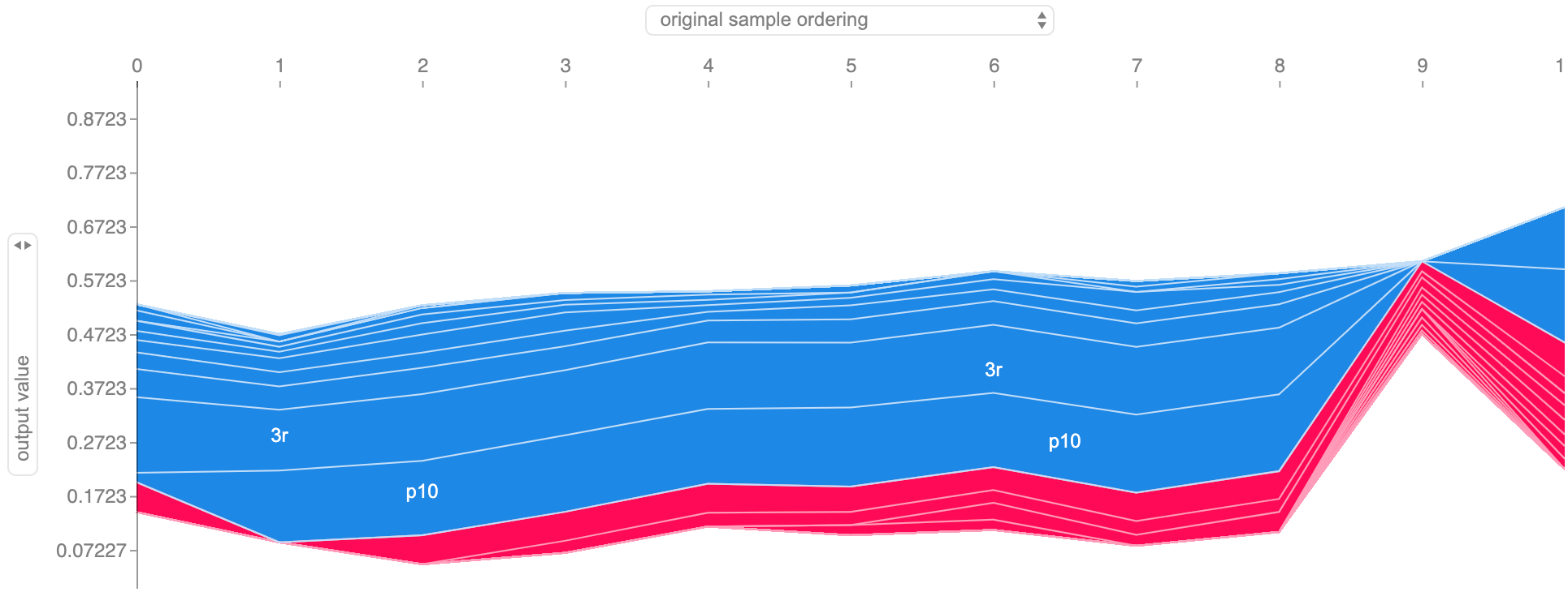
Force plot of the feature importance, for the same ALS patient, on timestamp 9. The size of each feature value’s block corresponds to its contribution.
Some interesting notes here:
-
The 7 top features, importance-wise, are all related to respiratory symptoms, especially 3r and p10 which come from respiratory evaluations performed by a doctor.
-
Disease duration, gender, and age are also among the features of greatest importance, which seems to make sense.
-
We now see a more detailed time-series visualization, with more features showing up. It’s also relevant that, due to regularization, we only see the 20 most influential features, in a total of 47 present in the dataset.
This interpretation was done on the time series of 183 patients, with a maximum sequence length of 20 and using zero as the reference value. I ran the code in Paperspace [8], on a C7 machine (12 CPU cores, 30GB of RAM). It took around 5 hours to finish, while the alternative of using 50 background samples was estimated to take around 27 hours. Now you believe me when I say it’s slow right? At least our reference value trick still manages to improve the running time.
Ok, now we do have all that we need. Right?
While it does seem like we got to the happy ending, there’s still something off here. The article is about interpreting models on multivariate time series data, however we’ve only addressed feature importance scores. How do we know what instances/timestamps were most relevant? In other words, how do we know the instance importance scores? Unfortunately, right now, SHAP doesn’t have that built-in for multivariate sequential data. For that, we’ll need to come up with our own solution.
Error 404: Instance importance not found
As we discussed, SHAP is mainly designed to deal with 2D data (# samples x # features). I showed you a change in the code that allows it to consider different sequences’ features separately, but it’s a workaround that only leads down to feature importance, without interpreting the relevance of instances as a whole. One could still think if it would somehow be possible to apply SHAP again, fooling it to consider instances as features. However, would that be practical or even make sense? First of all, we already have the slow process of using SHAP to do feature importance, so applying it again to get instance importance could make the whole interpretation pipeline impractically slow. Then, considering how SHAP works by going through combinations of subsets of features, removing the remaining ones (in this case, removing instances), it seems like it would be unrealistic. In real-world data where temporal dynamics are relevant, I don’t think it would make sense to consider synthetic samples where there are multiple gaps between time events. Considering all of this, in my opinion, we should go for a simpler solution.
An initial approach comes rather naturally: just remove the instance of which we want to get an importance score and see how it affects the final output. To do this, we subtract the original output by the output of the sequence without the respective instance, so that we get a score whose sign indicates in which direction that instance pushes the output (if the new output has a lower value, that means the instance has a positive effect; vice-versa for the higher value). We could call this an occlusion score, as we’re blocking an instance in the sequence.

Occlusion score determined by the effect of instance i on the final output. N is the index of the last instance of the sequence and S is the set of instances in the sequence.
While it makes sense, it’s likely not enough. When keeping track of something along time, such as a patient’s disease progression, there tend to be certain moments where something new happens that can have repercussions or be repeated in the following events. For instance, if we were predicting the probability of worsening symptoms, we could have a patient that starts very ill but, after successful treatment, gets completely cured, with a near-zero probability of getting sick again. If we were to only apply the previous method of instance occlusion, all instances of the patient after the treatment could receive similar scores, although it’s clear that the moment that he received the treatment is, in fact, the crucial one. In order to address this, we can take into account the variation in the output brought in by the instance. That is, we compare the output at the instance being analyzed with the one immediately before it, like if we were calculating a derivative.

Output variation score calculated through the derivative in the output caused by instance i. S is the set of instances in the sequence.
Of course, the occlusion score might still be relevant in many scenarios, so the ideal solution is to combine both scores in a weighted sum. Considering the more straightforward approach of occlusion, and some empirical analysis, I’ve picked the weights to be 0.7 for occlusion and 0.3 for output variation. And since these changes in the output can be somewhat small, usually not exceeding a change of 25 percentage points in the output, I think that we should also apply a nonlinear function on the result, so as to amplify high scores. For that, I’ve chosen the tanh function, as it keeps everything in the range of -1 to 1, and added a multiplier of 4 inside, so that a change of 25 percentage points in the output gets very close to the maximum score of 1.

Instance importance score, calculated through a tanh activation on a weighted sum of the occlusion score and the output variation score.
Despite the combination of two scores and the application of a nonlinear function, the solution remains simple and fast. For comparison, applying this method on the same 183 patients data and the same computation setting as in the previous feature importance example, this took around 1 minute to run, while feature importance demanded 5 hours.
Having this instance importance formulation, we can visualize the scores, even in multiple sequences simultaneously. I’ve been working on the time series plot that you see below, inspired by Bum Chul Kwon et al. paper “RetainVis: Visual Analytics with Interpretable and Interactive Recurrent Neural Networks on Electronic Medical Records” [9], where each row corresponds to a sequence (in my case, a patient’s time series), instances are represented by circles whose color indicates its importance (intensity indicates score magnitude, color indicates sign), and we can also add simple prediction meters, which give us a sense of what is the final output value.
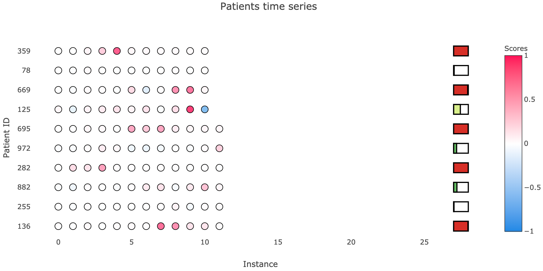
Example of visualizing instance importance on multiple sequences, along with their final probability.
Notice that patient 125 is the same as in the ALS example of feature importance. It adequately indicates timestamp 9 as a relevant, output increasing instance, while timestamp 10 reduces that output value.
Even though I hope that you like the logic and the plot that I propose for instance importance, I’m not quite ready to share this code with you, as it still needs fine-tuning. As part of my master’s thesis, I’m creating an API called Model Interpreter, which contains ready to use implementations of what we discussed here (SHAP for multivariate time series, instance importance scores and plot) and more. I hope to be able to make it public on GitHub until October. Meanwhile, feel free to explore more on these topics and to do your own experimentations! Remember also that my modified version of SHAP [10] is public, so you can already use that.
Final thoughts
If there’s something you should take away from this post, even if you just powered through the images and the memes, it’s this:
Although it’s still slow, the proposed modified SHAP can explain any model, even if trained on multivariate time series data, with desirable properties that ensure a fair interpretation and implemented visualizations that allow intuitive understanding; albeit an instance importance calculation and plot is still missing from the package.
There’s still work to be done in machine learning explainability. Efficiency and ease of use need to be addressed, and there’s always room for improvement, as well as the proposal of alternatives. For instance, SHAP still has some assumptions, like feature independence and local linearizability of models, which might not always be true. However, I think that we already have a good starting point from SHAP’s strong theoretical principles and its implementation. We’re finally reaching a time when we can not only get results from complex algorithms, but also ask them why and get a realistic, complete response.

No more black box models refusing to give answers.
References
[1] C. Perone, Uncertainty Estimation in Deep Learning (2019), PyData Lisbon July 2019
[2] C. Molnar, Interpretable Machine Learning (2019), Christopher Molnar’s webpage
[3] S. Lundberg and S. Lee, A Unified Approach to Interpreting Model Predictions (2017), NIPS 2017
[4] S. Lundberg, SHAP python package (2019), GitHub
[5] D. Becker, Kaggle’s tutorial on SHAP values (2019), Kaggle
[6] M. Ribeiro et al., “Why Should I Trust You?”: Explaining the Predictions of Any Classifier (2016), CoRR
[7] A. Ferreira, GitHub repository with a simple demonstration of SHAP on a dummy, multivariate time series dataset (2019), GitHub
[8] Paperspace cloud computing service
[9] B. Chul Kwon et al., RetainVis: Visual Analytics with Interpretable and Interactive Recurrent Neural Networks on Electronic Medical Records (2018), IEEE VIS 2018
[10] A. Ferreira, Modified SHAP, compatible with multivariate time series data (2019), GitHub
[11] R. Astley, Revolutionary new AI blockchain IoT technology (2009), YouTube